Designing and Decorating with Fall Colours

Fall is officially here. Thanksgiving is only a few days away and Halloween is around the corner - sort of. I am looking out of my window and see the rich colours of the turning leaves. Vibrant reds, muted oranges, ocher yellow and the last greens from light to dark just before they morph into the fall colours against soft grey or muted blue skies. Feel like nesting yet?
Colour in our environment is one of my favourite things to talk and write about. We all need colour in our lives. Imagine your home completely in tones of white, black and greys. Or, all of us dressed in grey and black. How 1984 and depressing. Wouldn’t that be just awful? With fall here I am beginning to get the feeling of wanting to cocoon. Creating warm spots to feel cosy and curl up with a good book, a glass of wine and Bach or Mozart in the background - or Netflix for that matter with some chocolate.

What a yummy corner, all ready to spend a rainy day in. Looking very European.
In the fall we tend to gravitate to warmer colours. Some people always go for the earthy, warm tones immediately. Others do not. I fall in the latter category. I like jewel tones, deep and saturated. During this time of the year however, I can appreciate these earthy tones a lot. And, of course the thought pops up to introduce fall colours into the home? Painting a hallway wall in a rich burgundy or burnt orange would feel welcoming and warm. Introducing a rich, warm tone such as amethyst or eggplant in the powder room would tie you over for the cold winter months as well.
Changing your decor from a light, airy summer look to a warm and cozy winter one is done a lot. People take off the summer slipcovers, roll up the summer rugs and go back to a winter look. Lets take a look at how some of the fall colours are used in homes around the globe and how you can introduce fall hues into your own home without breaking the bank and not too much effort. Are you up for it?
Yellows

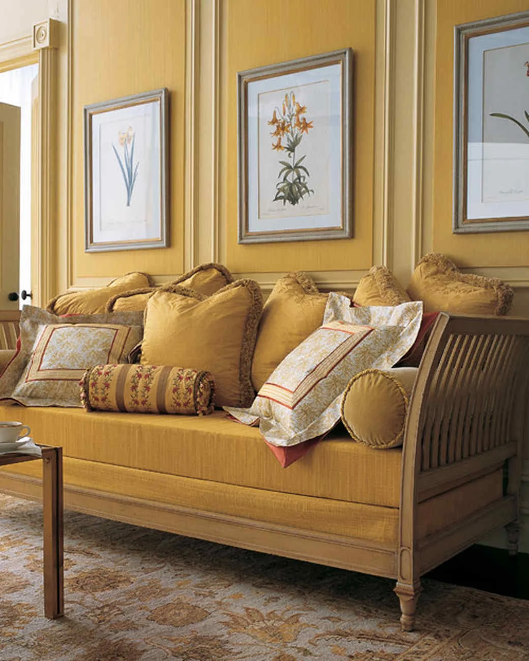
Do you have any artwork with yellow tones? Perhaps a golden picture frame? Hang them in your hallway on a soft white wall. Throw a muted yellow rug on the floor and right away coming home will feel warm and inviting. Or you have a sofa and lounge chairs in grey upholstery fabric. Team the pieces with yellow table lamps and black shades. Find some throw pillows in a variety of yellow, orange and red tones and your living room is all set for the winter months. The knitted yellow blanket is so easy to make. You can knit it on your arm! In one evening! Check YouTube for instructions.


Oranges

Design by Jessica Eken, Sophistique Interior Design
Orange can be an overwhelming colour and I recommend it be used sparingly and cautiously.
In the office kitchen of one of my clients I boldly designed and installed cabinetry in a saturated orange colour. It was a difficult colour to get just right. The finisher had to make several samples before it was just right. Orange is a difficult colour to work with
I teamed up the orange finish with a white backsplash tile and a listello mosaic with several orange and yellow tones in it. This small kitchen brightened up an otherwise grey and white concrete office space.
I added a grey purple wall to the reception area and its adjacent lounge. The two colours show great together and they are so unexpected when you first walk in. I like that.

Source: House Beautiful
The bedroom above looks cozy, right? Perhaps not for everyone, but people who like the colour orange can probably relate to this look. Some might find it overdone, what with the orange toned wallpaper behind the bed. But overall it really works. The orange headboard can be a DIY project for a long weekend in the next couple of months. Choose a rich velvet or chennille upholstery fabric for added softness. The orange ribbing on the bed linens coordinates really well with the headboard and the bed skirt. Even if you did nothing else the room would look great. Perhaps place an orange accent or two on the night table and you would be done. Orange and white or off white work great together. I think the effect of this room would be lost if the furniture was a dark wood tone.


Take a look how the walls of the bright white wall unit are painted a vivid orange. Together with the other orange accents this otherwise sterile room comes alive and looks attractive. Something you can do yourself! If you have a simple bookcase you can add some personality by painting the back wall a yellow orange. Another great DIY project for the fall months. The third image shows a painted cabinet with its center panels in a muted orange. The cabinet itself is painted soft grey. I really like how it lives against the warm French grey wall panels. Unexpectedly a set of creamy white complete the space. A cabinet like this is also a great DIY project.

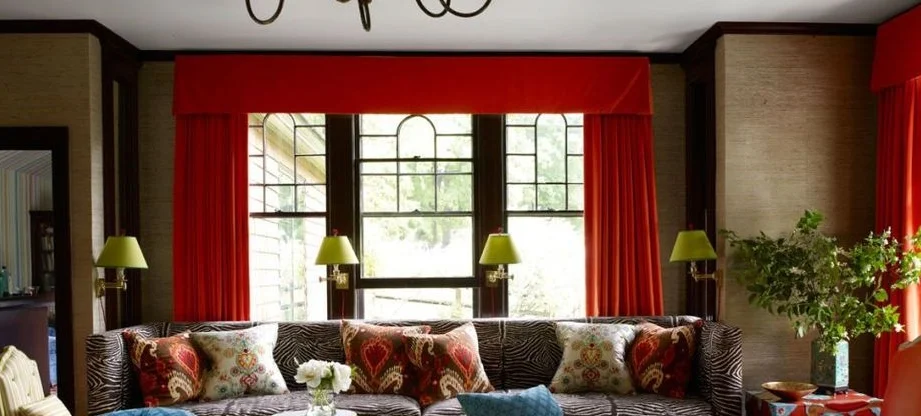
Reds
Scary image! A tad overdone here, right? The collection of dishes on the wall has been lacquered in tones of red and it teams nicely with the cushions on the sofa, the red chair and area rug as well. Not fond of the lamp though. The red tones do work well with the off-white sofa and muted creamy silver feel of the chest. What I am so not crazy about is the colour of the wall. It is too mauve to my liking. So not a suitable background for the plates and baskets. I would have much preferred a creamy white on the upper wall section. This would show the collection much better. The lower wall section could use a bead board in the muted silvery tone of the chest. To achieve the red lacquer you need to tint it with cinnabar or vermilion. Lacquer can be coloured another colour (black, green, yellow, gold, or brown) by adding different pigments,
Source: Unknown
I love the warmth of the living room above. The red drapes and accents make it so so inviting. The lime green of the wall sconces can be found back in the green upholstery of the chair on the left and in the throw pillows. Even the earthy toned walls fit this colour scheme so beautifully. Cozy and ready for relaxing when storms rage outside.

Source: House Beautiful
Another easy way to prepare your home for the winter months is by changing your rugs. Choose a warmer tone to complement your furniture with rich and warm reds. I like the feeling of this room It is super eclectic. It shows personality here. The rich green leather chair is beautifully anchored by the deep red and orange tones of the rug. I can just imagine what my toes would feel when walking bare feet across this rug. And again, this space is so abundant in colours in the items on the wall, that you could substitute this rug for any other tone. I can see a deep blue or muted yellow one here as well.
Purples
I have mentioned the colour amethyst or aubergine purple in one of my previous articles. It is such a fabulous colour to work with, but most people are nervous using it. We used to have a dark purple velvet sofa. I loved it but we wore it out and swapped it for a sky blue one. To this day I love that sofa and wish I had kept it… These purple colours look chic and expensive on walls, in rugs and furniture. Lampshades and throw pillows also lend themselves really well to these colours. Purple works well with a lot of other colours. It is not really a true warm tone, nor a cool one. It can therefore be accompanied by either cool or warm colours. It is kind of neutral.

Source: House & Home
This colour has different meanings in different parts of the world. it is associated with wealth, nobility, and sexuality or it represents royalty, wisdom, and ambition. Word has it that Cleopatra loved purple. Look how well the silver lamp shade complements the purple walls and picks up the grey tone of the chaise above. The brass side table looks equally comfortable in this colour scheme. An elegant corner.

Source: Blogbeen. This sofa strongly resembles our old sofa… Check the velvet upholstery and how it reflects light giving the material a beautiful sheen.
Blues
Blues are not typically associated with fall colours. When we think of blue we think of wide skies, lakes and oceans in summer time. In the right hue though, blues can be very suitable to a fall decor, as witnessed below.

Moody grey blue walls with a velvet look to them, matching baseboard and almost matching chair team with the orange tone of the wood floor. Blue and orange, in the right toned-down hues, can be an appealing combination. The golden yellow mirror frame on the mantle stands out like a jewel in this space. Love the logs in the fireplace and on the floor. A nice rustic touch.
Greens

Source: Elle Decor

Source: Elle Decor
Two bedrooms with a completely different feeling. The first one is masculine with its leather bed frame, leather panelled doors and green wall covering. It feels moody. The second one feels feminine. It is airy and light. The silver accents together with the silvery blue upholstery on the settee complement the green walls really well. This room is serene and calm, whereas the first one is dark (and I don’t mean dark as opposed to light), although I can see myself in such a room when a November storm is raging outside. A fireplace would actually make it perfect. Which of two rooms would you feel most comfortable in? Which one do you like best?

Source: Elle Decor
And, not to forget my favourite colour at the moment: emerald green. The velvet upholstery on this chair is rich in colour much like the purple sofa above. The French nailheads offer a wonderful accent. This chair would look good in various settings, not just this white panelled room which I find a bit too sterile to do the chair justice.. Creamy or blue grey walls would form an amazing background for this chair. Some brass accents and a knitted throw as shown before would complement it.
A cozy eating nook with olive green walls, crowns and baseboards form the canvas for an eating bench, or rather, in this case, an eating sofa. Family and friends can gather for Thanksgiving dinner comfortably.

Source: Better Homes & Gardens
Add some orange and yellow leafy accents, a candle holder or two, some pumpkins and you have an inviting eating nook to share your Thanksgiving dinner with friends and family.
Glass jars can be found anywhere these days. Purchase some chestnuts. Place them in the bottom and add the candles on top. Easy!
Love the pine cones at the bottom of the jar with flowers. Today even artificial flowers make great center pieces. I would not hesitate to use them.
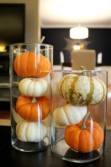
Or, fill the jars with small sized pumpkins and squashes for decoration. Don’t forget to place some cinnamon in hot water to fill the house with the fragrance of fall.


Browns
The colour brown is abundant in nature. From dark to light brown and every hue in-between. Wood furniture is usually clear coated, showing the wood’s striking grain and colour, or stained in a colour to achieve a particular effect. Wood floors are available in every brown tone you can think of. Exposed beam structures too can be found in various brown tones. This base colour can easily be offset by any of the other fall colours. The browns form an anchor, a backdrop if you will.

Source: Unknown
Happy Thanksgiving! May you have many things to be thankful for……