The New Paint Colours For 2023

Pantone 2023
Digital Lavender
Colour No. 134-67-16 or
Hex No. #E6E6FA
It’s that time of the year when many people start to think seriously about renovating. Vacation time is over. Trips to the cottage have wound down. The kids are back in school. University classes are in full swing and continuing education programs are signing up new students by the bus loads. Fall and winter clothes are pulled out of storage. Summer clothes are laundered and put away for another few months.
No matter what renovation you are thinking of, 95% of the time this will involve painting walls and ceilings. So, let’s take a look at what colours the big paint companies are promoting this year.
PANTONE
Pantone, the industry standard for colour, has nominated their Digital Lavender (Hex #E6E6FA) as the colour of the year for 2023. Close to blue, Digital Lavender is considered gender-inclusive and edgy. While this is a great colour for packaging, fashion and digital scapes, we find it really difficult to incorporate it into our homes, unless used sparingly as accessories or wall art.
Sherwin Williams
The largest paint company in North America is going in a completely different direction, a more relatable one! Sherwin Williams has announced its new colour Redend Point SW9081 as the colour for 2023.


A rich and neutral colour, Redend Point is not for everyone though. It is a blush-beige or rosy-brown hue that is warm and neutral with a hint of a blue undertone. The blue undertone affects how it shows on walls and trims. With lots of light, this colour shows clean and rosy, however, in darker rooms it will look more brown than rose. Something to think about! If you think of using this colour, make sure you paint test panels!


Sherwin Williams wall colours that team up well with Redend Point are Urbane Bronze SW7048, Foothills SW7514 and Poolhouse SW 7308, whereas Pure White SW7005 and Ibis White SW7000 are good trim colours.
Redend Point will more than likely end up being an accent colour rather than a primary field colour. A room with four walls of Redend Point could well be too much for some. The hue combines well with natural elements and accessories though, as shown above, and below. This reflects the trend toward more natural materials and for that reason, Redend Point may well be a great choice.


BEHR
In my professional career as an interior designer, I have never once specified Behr. At that time Behr was considered to be a lower-quality paint with not too many good colour options. However, things have changed over the past years. Behr has been issuing some great colours and the colour promoted for 2023 is no exception: Blank Canvas DC-003.

Behr’s Blank Canvas is an amazing neutral white. It is so neutral it goes with just about any other colour in their palette. It is so gorgeous, so gentle and inviting. It literally beckons to be used as a canvas, a backdrop for some colour art or artefacts. The colour is, as Behr says, limitless and we agree. Check out some of the images below showing rooms with Blank Canvas as the field colour on the walls.

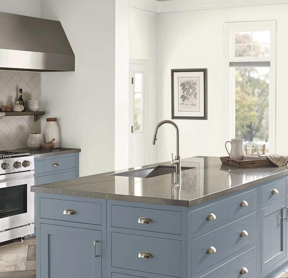


The kitchen above shows Behr’s Adirondack Blue (N480-5) as the accent colour on the cabinetry. A lovely combination. All images are courtesy of Behr.
BENJAMIN MOORE
Benjamin Moore has always had a great range of colours in its collections. For many, many years it was the standard paint colour company we used to specify paint colours. For its colour of the year collections, Benjamin Moore has selected palettes that range from calming to exciting.
The colour for 2023 is Benjamin Moore’s Raspberry Blush (BM #2008-30), a colour so delicious you just want to get the canapes and champagne out! Raspberry Blush is such a positive and energetic colour, it is hard not to be happy when surrounded by it. And we all know we can use some of that these days!


Raspberry Blush is as vivacious and optimistic, as it is bold and unapologetic. Definitely not a colour for the faint-hearted!
Whether as a field colour for walls, a feature wall or an accent colour, Raspberry Blush will set the tongues a-wagging. Team it up with Behr’s Blank Canvas white and we bet you’ll end up with a stunning combination.
Imagine your kitchen walls in this colour. With cooking smells enveloping the space, the deep tone on the walls, a glass of claret-red wine and you’ll have the makings of a party. And if you don’t have the courage to apply copious amounts of this colour in your home, you can just make your powder room a happy place.

DULUX
Did you know that Dulux names different colours of the year for the different continents? In Europe, Deluxe has named Wild Wonder its go-to colour for 2023, whereas in Canada it is Vining Ivy. Both colours could not be more different from each other.
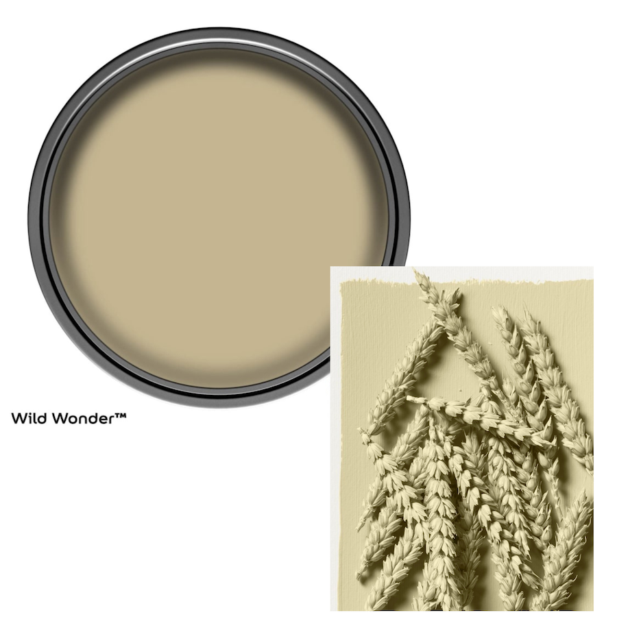

Inspired by nature, Wild Wonder is reminiscent of wheat, of fields flowing in the wind and glowing in the setting sun. Wild Wonder is a rich and lush colour, deep and saturated. At the same time, it is calming due to its muted look. It is neutral so it will be easy to combine it with other colours as shown below. The bedroom below shows Wild Wonder combined with a soft pink. The living room shows it with a base of a deeper tone of the same family.


Wild Wonder is easily influenced by the light and orientation of the room it is used in. When it is applied in a room facing South or West it will take on a more yellow glow. If the room is on the North or East the colour will be more on the green spectrum. Take a look at the images below. The room on the left is facing South whereas the one on the left is more on the North side, yet they are both Wild Wonder! This colour actually reminds us of the sage greens that were used so much in builder-spec homes a couple of decades ago. What once was, comes back again…

The influence of light shows very clearly in these two rooms. Caution is required!
Vining Ivy is bold in comparison to Wild Wonder. This versatile teal hue works really well with rich wood tones and pops of colour in jewel tones. The green-blue in Vining Ivy is calm and reminiscent of deep water as well as hazy mountain vistas. While it is a striking colour, it probably is not for everyone.
Mitsu Dhawan, Dulux brand manager, calls this colour an “… uber-earthy and rich, sanctuary-like color choice for the home. As opposed to softer neutrals that have been popular in recent years, this new nature-inspired tone is bolder and more expressive, reflecting an optimistic mood as we emerge ready for the next normal.”


The colour looks very rich and inviting on the walls in the images above. The application of it to the kitchen cabinets in the image to the right is particularly inviting, but rather on the cool side which makes it lose some impact. The stark white countertops and backsplash together with the pure white walls and door influence Vining Ivy to that cool feeling. Behr’s Blank Canvas would have been a better choice for the walls and the door.
FARROW & BALL
Farrow & Ball is a British paint company, located in Dorset. The Farrow & Ball paints are typically rich and alluring. Not an inexpensive paint, Farrow & Ball has found a loyal following in North America. Its finishes are hard-wearing, toy-safe, and long-lasting. These paints have a high-performance level which has surely contributed to their popularity.

Farrow & Ball
For 2023 Farrow & Ball has added 11 very rich paint colours to its modest colour collection (132 at this point). All of these colours are deeply rich with lots of pigment. Good coverage is assured. In contrast to other paint manufacturers, Farrow & Ball has not called any one of these new trendy colours its Colour of The Year 2023. Instead, all eleven are equally promoted. We will only cover the most trendy ones here.


In the grey tones, we find Hopperhead (#305). A classic charcoal colour, deep in saturation and utterly dramatic will add a cosy feeling to any room. The dark blue Wine Dark (#308) is another rich, jewel-tone colour, equally dramatic as Hopperhead. The third trendy colour is Bamboozle (#304), a colour sure to bamboozle you. Close to Benjamin Moore’s Raspberry Blush, Bamboozle is also deeply saturated. In the image above the wainscoting is painted out in Bamboozle while the walls above it are in Templeton Pink (#303).
Now, get out your paint brushes, pan and drop cloths and start updating any one of your rooms (or your entire home) with the colour of your choice!
Did you enjoy reading about the new colours for 2023? Did you like the images showing the application of these colours? So, which colour would you pick for your home? Would you go dramatic or stay safe?
SHARE YOUR THOUGHTS IN THE COMMENTS SECTION BELOW.
All images are courtesy of the paint manufacturers.
See you next time! Jessica & Loretta