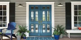
What are the new colours this year?
While the year is still young lets talk about the colours of the year that have been chosen by various paint companies. All of these companies choose their own ‘colour of the year’ and they are never identical. Personally I am not sure why each company feels they have to choose a colour, except that it is a good marketing tool.
One of the colours of 2019 most talked about at the moment is Pantone’s Living Coral. Pantone is the US company which has standardized colour matching through its PMS, or Pantone Matching System. This system allows numerous industries to choose specific colours for their products, match them at any time and always receive the same results. Some countries specify Pantone colours for their national flags. Canada is one of them, as is South Korea. The printing industry relies on the PMS. Graphic designers use the PMS in their designs. The textile industry depends on the PMS. Well, you get the picture.
Lets take a look how the ‘colours of the year’ for 2019 can be interpreted in interiors.
Source: Pinterest
Pantone - Living Coral
Living Coral has been welcomed by some people as a wonderfully warm colour while others have been critical of Pantone to make the reference to living coral since coral reefs are an endangered species in certain parts of our oceans. Perhaps naming the colour Living Coral will actually draw more attention to the dying coral reefs out there. And, that would be a good thing.
Personally I would use this coral tone sparingly under the best of circumstances. While the colour is truly warm and inviting, it is also very feminine. And that might not be so appealing to everybody. A small settee adorning a wall, as seen above, would be a great place to introduce this colour. Or painting your front door this spring in this colour as a warm and welcoming gesture to your guest. The colour shows really great in the above image because of the white columns and trim around it. This wonderful effect would be lost if this door was placed in a brick facade, due to the reddish tones of brick in general, but a white stucco or clapboard house could easily carry this colour on the front door.
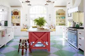
In the kitchen it could be introduced to a kitchen island only as an accent colour with small appliances, tea towels or table ware to match. As I have mentioned in a prior article, giving some colour to your kitchen by painting the cabinetry of the island is a safe way to introduce some excitement. If after some time you get tired of the colour, or you get excited by a new one, the expense of changing the colour is minimal, as is the effort to actually to do so.
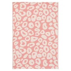
Annie Selke’s Spot Coral rug above would make a great decorative element in a room with dark wood tones or white furniture. A small eating nook or a baby’s room come to mind. A hobby room would also look splendid with this rug.
Sherwin Williams - Cavern Clay SW 7701
Sherwin Williams, the second largest paint company in the world, choose a terracotta colour called Cavern Clay which is in the pink brown family of colours. The colour reminds me of old clay pots, of ancient civilizations lost, of adobe dwellings under a hot sun and archeological digs in the Sahara. The colour does really well with organic materials such as straw or fibres (think rugs or baskets), with old weathered leathers and rustic materials. Sherwin Williams teams it up wonderfully with a grey blue called Distance which tones down the ‘heat’ of Cavern Clay. In the center image below the wall shows Cavern Clay and the rug makes a reference to Distance. See how great they look together?
While Cavern Clay would never be a go-to colour for me, I can see its value in certain applications. Instead of standard medium-brown woods cabinets in a kitchen, this colour is a good one for painted cabinets. The kitchen image above shows an island against a backdrop of crisp white cabinets. Great combination.
Dulux Paint - Spiced Honey
Source: Dulux Paint
Dulux Paint a subsidiary of AkzoNobel (Netherlands) chose a colour I have difficulty relating to. Spiced Honey was chosen as both a calming colour as well as an energizing one at the same time (as per Heleen van Gent, Head of the Global Aesthetic Centre in Europe). Since new paint colours are chosen in the fall each year, Dulux choose this colour to be a reflection of a rather tumultuous year with a look to the future of moving forward in sometimes difficult times.
Again not a colour I would automatically gravitate to, but it does show very well with whites, navy blues and burgundy reds.
Source: Dulux Paint
Take a look at the image above. Spiced Honey is applied to the wall behind the sink cabinets. Here the colour takes on a luminous quality. The dark, navy blue cabinets show great against the Spiced Honey backdrop. The copper pots make me think of the colour burgundy.
Now on to Benjamin Moore which goes a completely different direction.
Benjamin Moore - AF-690 Metropolitan
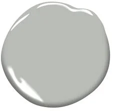
I have been specifying grey wall and trim colours for a long time now. Am I ready for a different colour palette? You bet I am. Whites are appealing to me now and I know other designers are feeling similar. Is the decade of the reign of grey reaching its conclusion? Not according to Benjamin Moore. Their chosen colour is Metropolitan (AF-690). A soft grey tone with a sophisticated and elegant look.
Source: Benjamin Moore
Lori Sawaya, a US based colour strategist, shows an analysis of Metropolitan grey in one of her blogs. She places this colour in the green-yellow hue family and if you look carefully, you can actually see the green in this grey paint colour. It really is there. It is nearly invisible in the ‘wet’ paint sample below, but it becomes clear that there is green in this colour when it has dried on the wall as all images show. This colour is one which easily and effortlessly coordinates with a number of other colours. The colour falls in the middle of the light spectrum for this tone and as such it is perceived as a true grey colour by most people. It is one of Benjamin Moore’s most neutral grey tones.
Depending on the light that highlights Metropolitan, the colour can look green, blue-ish or even purple-ish. Of course, any artificial lighting with a yellow glow will emphasize the green in this grey colour. In daylight it is much more grey. I would guess though that in bright sunlight, the green will come forward again.
In my previous article I talked about pastel colours becoming popular again. In the right image of the three above (source Benjamin Moore) Metropolitan is shown as the canvas for a soft pink chair. Together these two colours look positively wonderful. Metropolitan looks fabulous even with weathered wood tones. Benjamin Moore coordinates Metropolitan with among other colours: soft blush, deep navy blue and a teal-ish dark green or a soft fern green. All interesting colours.
Source: House Beautiful
Perhaps the decade of the colour grey continues…!
Last but not least there is Behr paint. I have never specified Behr paint, but this year’s colour is a good colour. However, it is not likely I will ever recommend Behr paint to my clients since Home Depot sells this product and I am so not a Home Depot client after my two negative experiences with this company. Yep, I am biased against Home Depot! (For home products I shop at Lowe’s or Home Hardware!)
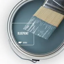
Behr Paint - S470-5 Blueprint
Blueprint is a grey blue colour, pretty in and of itself. It reminds me of Sherwin Williams Distance (discussed above) and as such it would coordinate well with a terracotta or clay colour, much like Sherwin Williams Cavern Clay. It also looks really good with the mustard yellow fabric on the sofa below.
Source: Behr
Behr shows a number of colour palettes with Blueprint being coordinated with mauve and sage green tones. Neither of these two colours speak to me. However, the colour works really well with soft beige or greige as shown below. The colour is subdued enough to be used as an exterior house colour.
Enough about colours even though they brighten my otherwise wintery white day!
On a last note: the cover photo is courtesy of AkzoNobel, the Netherlands.
Thank you for visiting and let me know which of the colours above captures your imagination. I would love to hear from you.


